How to Paint a Home as Part of Home Staging: Choosing a Palette (with before and after images)
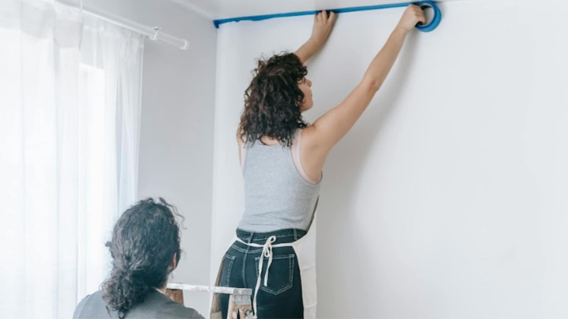
Painting isn’t difficult, and there isn’t necessarily a completely right way or wrong way to do it, there’s just better and worse. Done well, painting can deliver some of the best ROI when prepping your home for the market. According to industry data, a fresh paint job can significantly boost your home’s appeal and potential selling price. According to the source, repainting interior walls nets an average ROI of 107% (adding 107% of the cost of painting to your homes value) as well as likely selling much faster!
If you’re planning to DIY or you’re simply choosing colors to make your home more marketable, understanding how to paint a home for sale means doing a little research first. The more informed and practiced you are, the more professional your results will look. A sloppy paint job stands out immediately and can make buyers wonder what else in the home may have been done carelessly, never the impression you want to give.
Why Painting Matters in Home Staging
Here are the most common reasons to paint a room, an area, or even your entire home, inside or out, when preparing it for sale. These home painting tips are especially relevant when painting for staging, because painting helps you:
- define the style and mood of your home so buyers instantly “get it” and fall in love
- make small rooms or awkward spaces feel larger and more cohesive
- clarify different functions within a big or open space by differentiating zones using related colors or a strategic pop of color
- brighten a dark room or the overall home
- refresh and update the look so the property feels clean, cared-for, and move-in ready
- neutralize personal or highly specific taste to appeal to a broader pool of buyers
If you’ve mentally checked any of the boxes above, a fresh coat of paint will almost certainly help your home show better and sell faster.
The walls, ceilings, and trim create the backdrop for your staging. These elements should support the overall design message and highlight the home’s best features. You’re simply helping buyers understand the home’s personality without being there to explain it. If most rooms are already painted in market-friendly colors, you may only need to update one or two outliers to create a more cohesive look. In some cases, a whole-home color refresh, inside or out, might be the smarter choice. Think of it this way: you’re choosing not just a paint color, but the canvas that sets the tone and mood for the entire property.
Before and After Example:
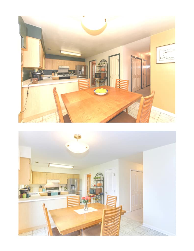
A single, continuous wall color was used to visually expand the kitchen and connect it to the adjoining living space. By removing visual breaks and minimizing highlighted trim, the space reads as one cohesive volume, allowing buyers to focus on size, flow, and livability rather than individual walls.
Using Paint to Define the Style and Mood of Your Home
Once you’ve assessed the property and its market, identified your likely buyer, and clarified your staging concept, paint becomes one of the easiest ways to reinforce that design direction. Choosing between different paint styles allows you to strengthen the story the home is telling buyers. If you’re unsure which style buyers expect in your price range or area, Houzz and Pinterest are great places to look for inspiration. Here are some ideas about choosing a color palette to suit the vibe of the property.
Cottages
For a vintage or sweet cottage vibe, choose pastel tones that immediately signal charm and nostalgia. For a more natural cottage, warm cozy colors can make gathering spaces feel inviting. If the cottage is very small, or smaller than competing listings, lean toward warm light colors to keep things feeling open. Use darker tones sparingly as accents, such as behind a bed or in a reading nook.
Modern Homes
Modern architecture often plays with volumes, voids, and continuity, so carrying the exterior palette indoors can make the home feel cohesive. Whites, tans, and greys are common because they align with what many buyers already expect in contemporary design.
Historic or Period Homes
Use historically inspired palettes but update them for today. Older schemes (Victorian, for example) can run dark, so use those rich hues sparingly, in feature rooms or focal points and consider a more neutral tone from that era to unify main spaces.
Coastal or Waterfront Homes
Let the home’s purpose guide you. For relaxation and serenity, use soothing sophisticated neutrals like gentle sand tones, sea-glass greens, sky blues, and soft driftwood grays.
For a vacation-energy vibe filled with activities and family gatherings, use a more crisp palette with some contrast, incorporate some well-placed pops of color for fun and visual interest.
Luxury-Market Properties
A clean, neutral backdrop instantly conveys elegance, think barely off-white paired with black or deep accents. When considering adding a pop of color, consider luxury brand products for color direction inspiration.
For location properties, choose colors that complement, not compete with, dramatic views, deep greys, taupes, or colors that pull from the landscape to frame views, not compete with them. In the case of smaller luxury homes, it’s probably the only case where I might sanction the use of a sumptuous, darker palette as the main theme, but here, it can be effective, creating a jewel-like property.
Mountain Retreats
Natural colors often work best with tans, warm greens, soft sages, delicious browns, and soft blues added to neutrals in the background, but the key is harmony. Colors should “speak to each other” without competing. If some modernity is required, choose an off-white, which pairs beautifully with natural wood. Pure whites or sharp primary colors usually clash with muted, earthy tones.
Midwest Farmhouse Style
Look at neighboring successful properties for cues on color palettes, which tend to be warm, simple, and grounded in tradition and family. Much of the décor and staging emphasizes the beauty and charm found in everyday functionality.
Southwest and Desert Homes
These homes often frame the landscape, or feel naturally integrated into it, so bring those atmospheric colors and light indoors in a way that suits the home’s design, arrangement, and size. If the openness and spaciousness of the southwest landscape, or the simplicity of the design or the materials, are reflected in the architecture, lean into that and continue the language. Choose colors that enhance the sense of flow, so rooms transition easily from one to the next.
Tropical Properties
Tropical properties are often styled with a more local cultural influence, often with local materials and building styles dictating the palette for you. You can choose to acknowledge this influence and its usual color palette because most buyers may expect it or, in the case of a more unusual property, go against the grain and be unique because, well, the property already does that. Regardless, your primary focus is likely the synergy between inside and out and the transition between the two.
Urban Spaces
If the property needs a youthful, energetic city vibe, introduce that energy through materials or selective pops of bold color like navy, olive, or terracotta, on accent walls or in small architectural niches. In small spaces, keep the overall palette light so the home reads as one large, connected environment. Another common direction in urban property design is one of sophistication. Otherwise, sophistication can be offered in a more reserved, tranquil retreat styling. Sometimes that can come in the form of an early-adopter or trend-setting design where the color palette needs to follow suit.
In any of these cases, take inspiration from similar, comparable properties to give the property an up-to-the-minute, freshly styled color palette that will be competitive. Buyers will be expecting to be wowed in any case, and here, you can and should be a bit more daring.
Suburban Family Homes
Since this type of property often falls into a “Transitional” style category, somewhere between modern and traditional, pairing a functional layout with classic exterior cues. When staging this type of home, consider the lifestyle of the likely buyer: a busy family with little time for upgrades. Give them a calm, serene backdrop with just a touch of luxury to feel like a reward at the end of a long day.
Start with warm, inviting neutrals such as soft greiges, warm whites, and creamy beiges (think Alabaster, Swiss Coffee, or Accessible Beige) to establish the base palette. These home staging paint colors create a flexible backdrop for a wide range of buyers. Then elevate the look with a contrasting color scheme in strategic spots: a terracotta/teal pairing, or a wine-leaf green with merlot or fuchsia as examples. Finally, add warm brown, copper, or warm gold to bring depth, richness, and a sense of lift to the overall design.
We cover this in more detail in our overview of the principles of spatial design, where color plays a key role in shaping how rooms are experienced.
Now you have a palette to reflect and enhance the style of the property. Let’s take a look at how to draw the most out of each individual room or space.
How to Use Paint to Make Smaller Rooms, Spaces, or Areas Feel Larger
Bring separate, disjointed rooms together into one cohesive design by using a single color throughout. My go-to is a single soft light neutral or a shade of white, a cool, clean yet soothing vibe. It looks fresh and intentional, clean, but not like the stark and unfinished white of new drywall, so it signals to buyers that you made a thoughtful design choice. If your space needs something more than white, consider space-expanding tones like pale taupes, extremely light warm grays, or subtle light pastels that bounce light and make rooms feel larger.
Before and After Example:
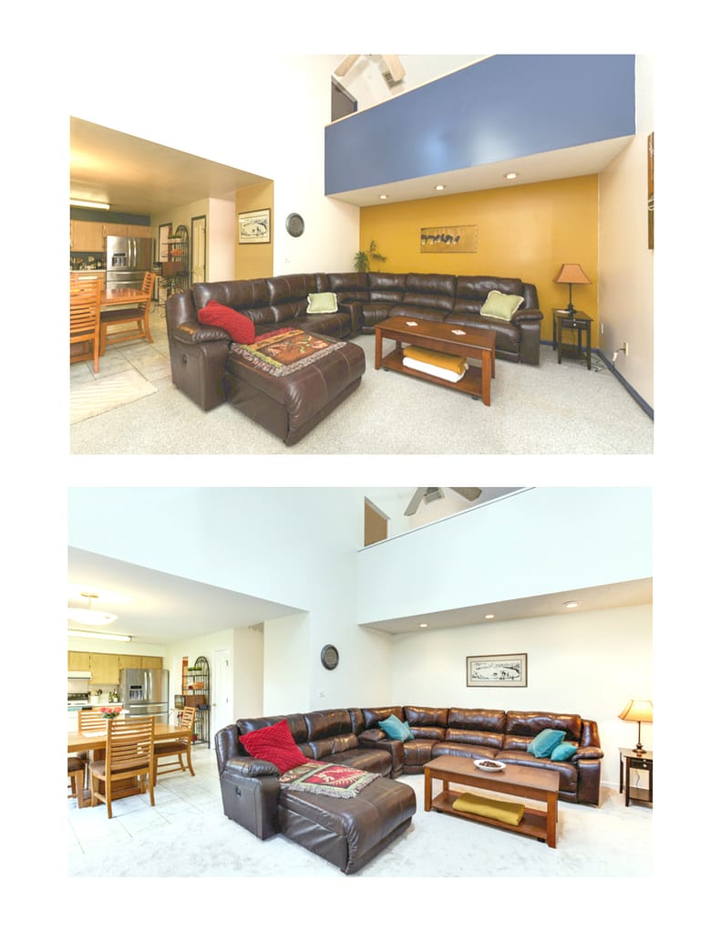
Here, I wanted the space to read as one large, open volume rather than a collection of different planes. A single light wall color removes visual noise and allows the architecture and scale to stand out naturally. The variation in light and shadow across the white surfaces is enough to add interest, and the overall effect is a calmer, more expansive room that appeals to a wide range of buyers.
When multiple spaces share the same hue, they visually connect and read as one larger area. Don’t just consider a buyer’s experience when visiting the home; you have to first consider how the online photos will attract buyers to even want to make the viewing appointment.
“When every room is a different color and you look at it online, it looks like you’re going through an Easter egg hunt. When you have all the same color, each picture flows into the next one.”
If you’re trying to downplay or minimize odd room shapes, a single shade of a light color or shade of white is also a good bet, since it will minimize wall edges and angles and highlight the volume. This is where the choice of flooring is also important (avoid geometric or orthogonal lines).
Using Paint to Break Up Larger Spaces and Define Different Functions
Paint is one of the easiest ways to break up a large, open space and subtly define how each area should function. By using related, but not identical, colors, you can create gentle visual boundaries that guide the eye without disrupting flow. A slightly deeper tone behind a dining area can make it feel more intimate, while a lighter shade in the living zone keeps things open and airy. Strategic accent walls or color-blocked niches also create natural focal points, drawing attention to architectural features or key areas you want buyers to notice. When done well, color becomes a quiet way of organizing a big room so it feels intentional, balanced, and easier for buyers to imagine living in.
Paint is an easy and effective way to break up a large, open space and subtly define how each area should function. By using related, but slightly different colors, you can create visual cues that separate zones without interrupting the overall flow. A richer tone behind a dining area can make it feel more intimate, while a softer hue in the living space keeps it bright and welcoming. Thoughtful accent walls or color-blocked niches naturally create focal points, highlight architectural features, and help buyers immediately understand how the space is meant to be used. Done well, paint becomes a gentle guide that organizes the room and makes the entire home feel more intentional and inviting.
How to Brighten Up a Dark Space or Home with Paint
Nothing lifts a space, or a buyer’s mood, like good light. Numerous studies on light’s effects on our dopamine back this up. If a room doesn’t have enough of it (or you can’t create it), attracting buyers becomes much more difficult. Light also makes rooms feel larger because lighter colors visually recede, expanding the space. And with more light, buyers can actually see more of the home: those dark corners become usable square footage, and the colors and textures of your décor appear cleaner and more vibrant. One of the easiest ways to brighten a home—short of enlarging windows or pulling back heavy window treatments—is to paint the walls a light color, ideally a shade of white. It bounces light around the room and instantly gives the space fresh energy.
Before and After Example:
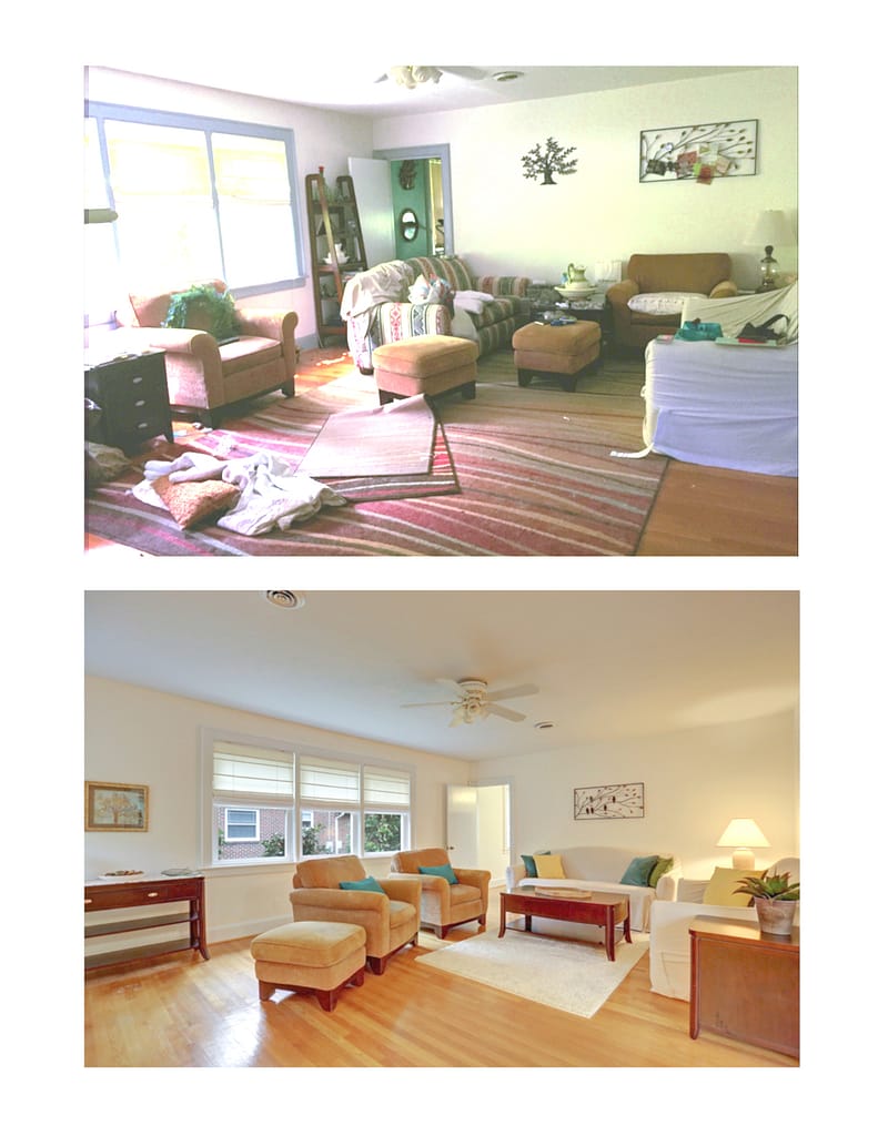
This room already had good bones, it just needed a little restraint. Simplifying the palette and reducing visual clutter allows the space, light, and wood floors to do the work, making the room feel calmer, more open, and easier for buyers to connect with.
Freshening Up Your Home with Paint
A fresh coat of paint is one of the quickest and easiest ways to make a home look, and even smell, clean, renewed, and well cared for. Over time, colors fade, yellow, or get scuffed, and while you may no longer notice these things, buyers seeing your home for the first time definitely will. Those small signs of wear can lead them to assume the rest of the property hasn’t been maintained.
New paint, on the other hand, is exactly what buyers instinctively associate with new or renovated property. Use that psychology to your advantage. Plus, being able to market the home as “freshly painted” is a simple but powerful selling point.
Before and After Example:
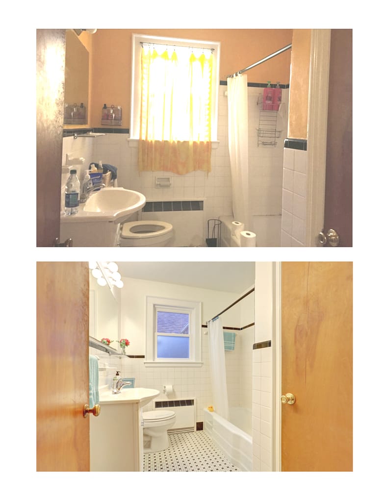
The original yellow accent was fun, but very specific and not repeated elsewhere in the home. Carrying the same neutral wall color used throughout the house into the bathroom immediately creates continuity and makes the historic tile a feature rather than a distraction. The softer palette feels calmer and more balanced, while still leaving plenty of room for the new owner to add their own color if they choose.
Removing Personal Style with Neutral Paint Choices
If you’ve read our posts on depersonalization, you already know that while your style is perfect for you, it’s unlikely a buyer will have exactly the same tastes or needs. And because you want to sell quickly and keep your negotiating power, you need to appeal to the widest pool of buyers possible. Unless you’re a top interior designer and your bold or quirky palette is an award-winning masterpiece, it’s smart to remove unusual or highly personal colors. Think of it this way: everyone deserves the chance to make their private home a reflection of themselves. But if your personality is still “loud and proud” on the walls (hello, purple bedroom), buyers will struggle to picture their own personality in the property.
Before and After Example:
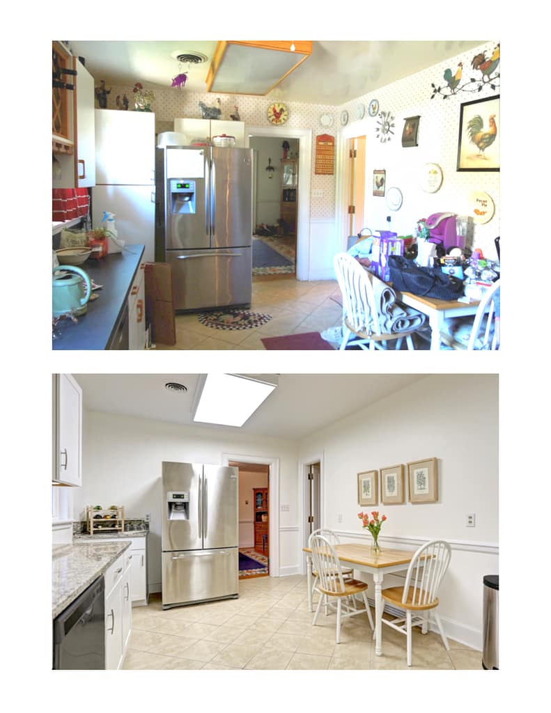
There was a lot of personality in this kitchen, but it was very specific to the owner and visually busy for such an important space. Painting the entire home in the same warm white helped unify the rooms and made the kitchen feel larger and calmer, which was especially important for an eat-in layout. By removing decorative distractions and simplifying the palette, the focus shifts to function, flow, and the quality of the space, leaving a clean backdrop for the next owner to make it their own.
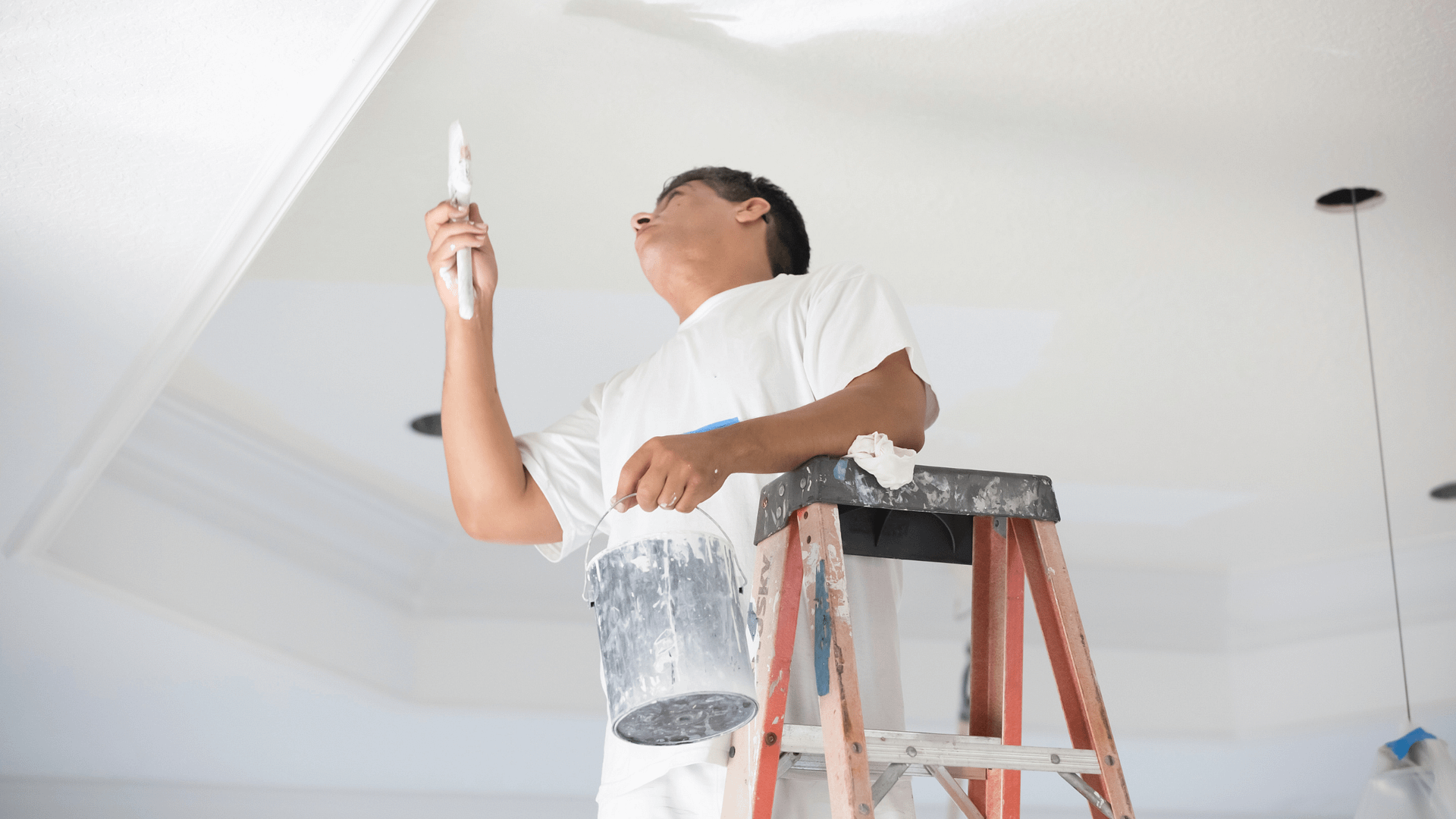
Refreshing Your Painting Approach Before Selling
Should you just spot-touch small holes in walls or nicks and chips on trim?
Before you grab a brush, ask yourself one key question: How old is the existing paint? If it’s more than a few months old, a simple touch-up likely won’t blend in and will become a distraction. Paint changes color naturally as it ages, thanks to chemical shifts, sun exposure, and everyday dust, so a fresh dab of paint can stand out like a patch.
In those cases, it’s better to repaint the entire face of the surface (or the whole wall, though not necessarily the entire room). Each wall already reads a little differently depending on how light hits it, so repainting the full surface helps avoid visible color variations, especially at corners and direction changes. The goal is a seamless finish that doesn’t draw attention to itself.
Other Aspects of Paint to Consider When Making Your Selections
Once you’ve chosen your paint colors, don’t forget the finish, because sheen truly matters. Different finishes reflect light differently, which can subtly change how a color looks. Matte finishes are great for hiding wall imperfections like dings and scuffs, making surfaces appear smoother and newer. Eggshell and satin offer a bit more sheen and can add gentle dimension to the walls. For ceilings, a flat white is usually best because it hides flaws and reflects light, helping the room feel larger and brighter. Semi-gloss is ideal for trim, molding, and doors, giving them a clean, modern look, as long as the surface is smooth. On bumpy or uneven walls, however, shiny finishes highlight every flaw and can make the home look older or more worn.
Testing Paint Colors Before You Commit
Once you’ve narrowed down your ideas about color, grab some swatches.
If you take only one thing from this article, let it be this: you must test paint colors in the actual space. Countless factors can shift how a color looks from location to location, its sheen, the amount and quality of natural or artificial light, the flooring tone bouncing up onto the walls, even the color of the furniture. I’ve literally had green grass outside a bedroom window make a wall color look greener, and had to adjust the paint choice because of it.
Bring swatches into the room and tape them to the walls, or use the larger adhesive samples (ideally in the same sheen you plan to use). And remember: if the swatch is shiny and your final paint will be less shiny, the painted wall will read slightly darker.
I recommend buying small sample pots and painting them onto squares of cardboard that you have already primed in white, so the brown cardboard doesn’t distort the color. Once they’re dry, hold each sample against every wall in the room to see how the color shifts. And if you compare two sample colors side by side, keep in mind that they influence how you see each of them, just like the blocks on a fan deck. We can perceive a color differently if it is affected by what color sits next to it.
Using Color to Correct or Change Spatial Perception
Here are some ideas on how to use color in a room to correct or change the spatial aspects:
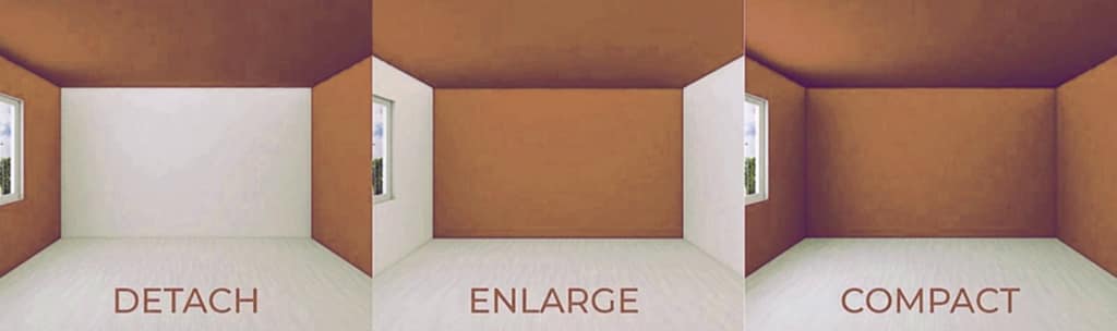
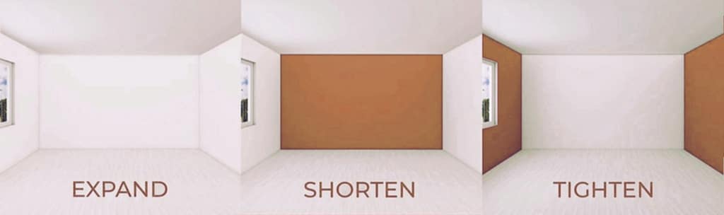
Color isn’t just decorative, it’s spatial. Depending on where it’s applied, it can make a room feel wider, deeper, taller, or more contained. Light colors help surfaces recede, while darker tones bring planes forward. Used thoughtfully, color can correct proportions, reduce visual confusion, and help a room read more clearly, without any physical changes to the space.
Final Thoughts on Painting as Part of Home Staging
A thoughtful paint plan isn’t about chasing trends; it’s about translating the story your home needs to tell. Every choice you make, from a barely-there white to a strategic pop of color, works together to clarify style, shape space, brighten light, and remove distractions so buyers can focus on what truly matters: the home itself. When you approach paint as part of the staging strategy rather than an afterthought, it becomes one of the simplest, most cost-effective ways to elevate the entire property. Ultimately, you’re not just refreshing walls, you’re shaping perception, guiding emotion, and giving buyers the quickest path to imagining themselves living there. That’s the real power of a well-painted, well-presented home.